More Than Just Pasta: Pasty
While pasta has been a kitchen staple for centuries, it is often viewed as just a mundane source of carbs in the modern world. When we started the Pasty project, our goal was to completely shatter this perception. We redefined pasta not just as food, but as an iconic lifestyle element sitting right at the center of culture, style, and modern life. By blending traditional Italian heritage with the dynamism of urban living, we built a brand identity that spills out of the kitchen and into popular culture.
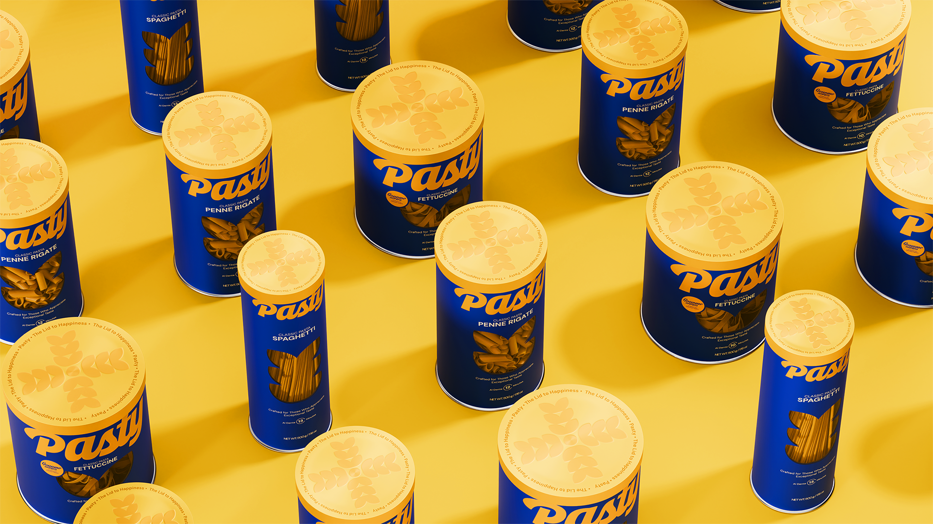
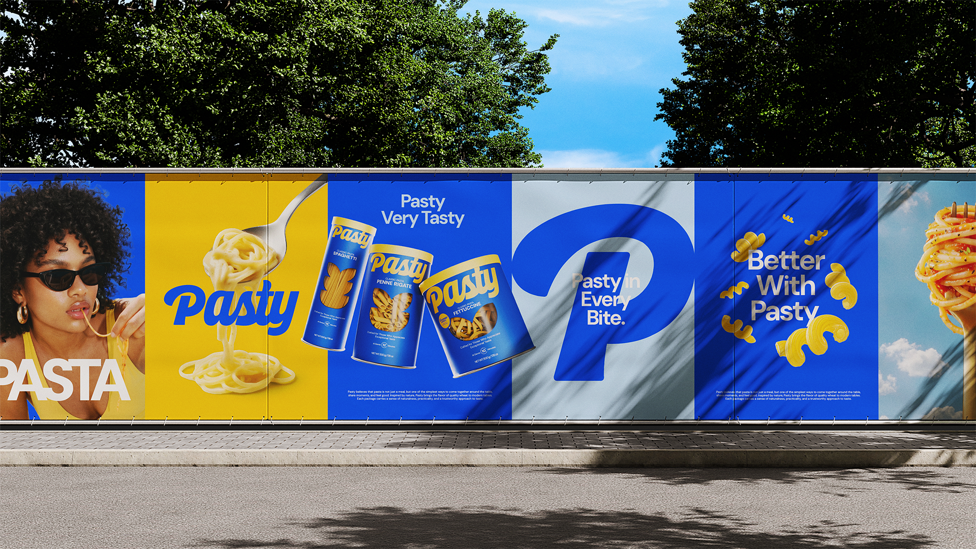
For the visual language of the project, we created a bold world that blends Mediterranean warmth with modern minimalism. The contrasting energy of ocean blue and sun yellow represents the brand's refreshing and free spirit. While the fluid, organic lines in the logo and typography pay homage to the aesthetic form of pasta itself, the strong visual hierarchy ensures that Pasty maintains a cool, premium, and distinct presence across all digital and print mediums.
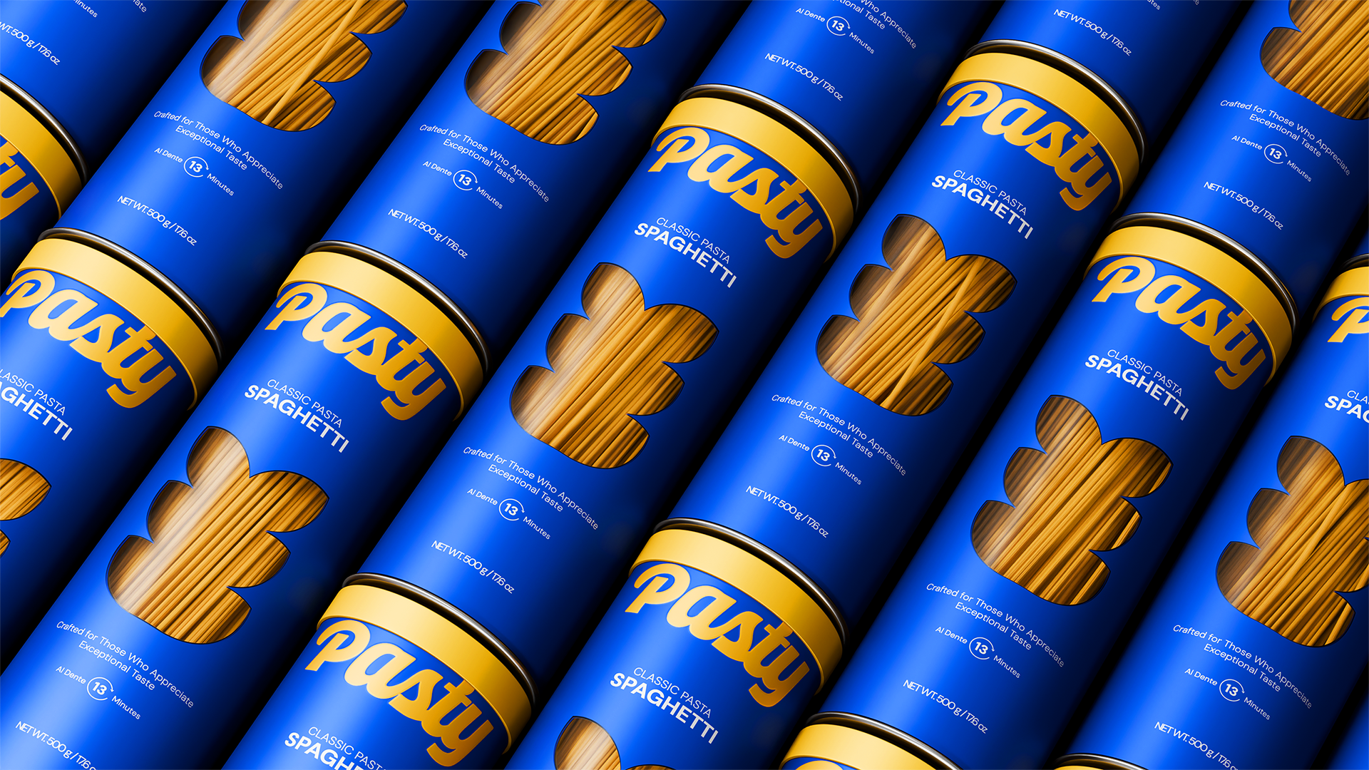
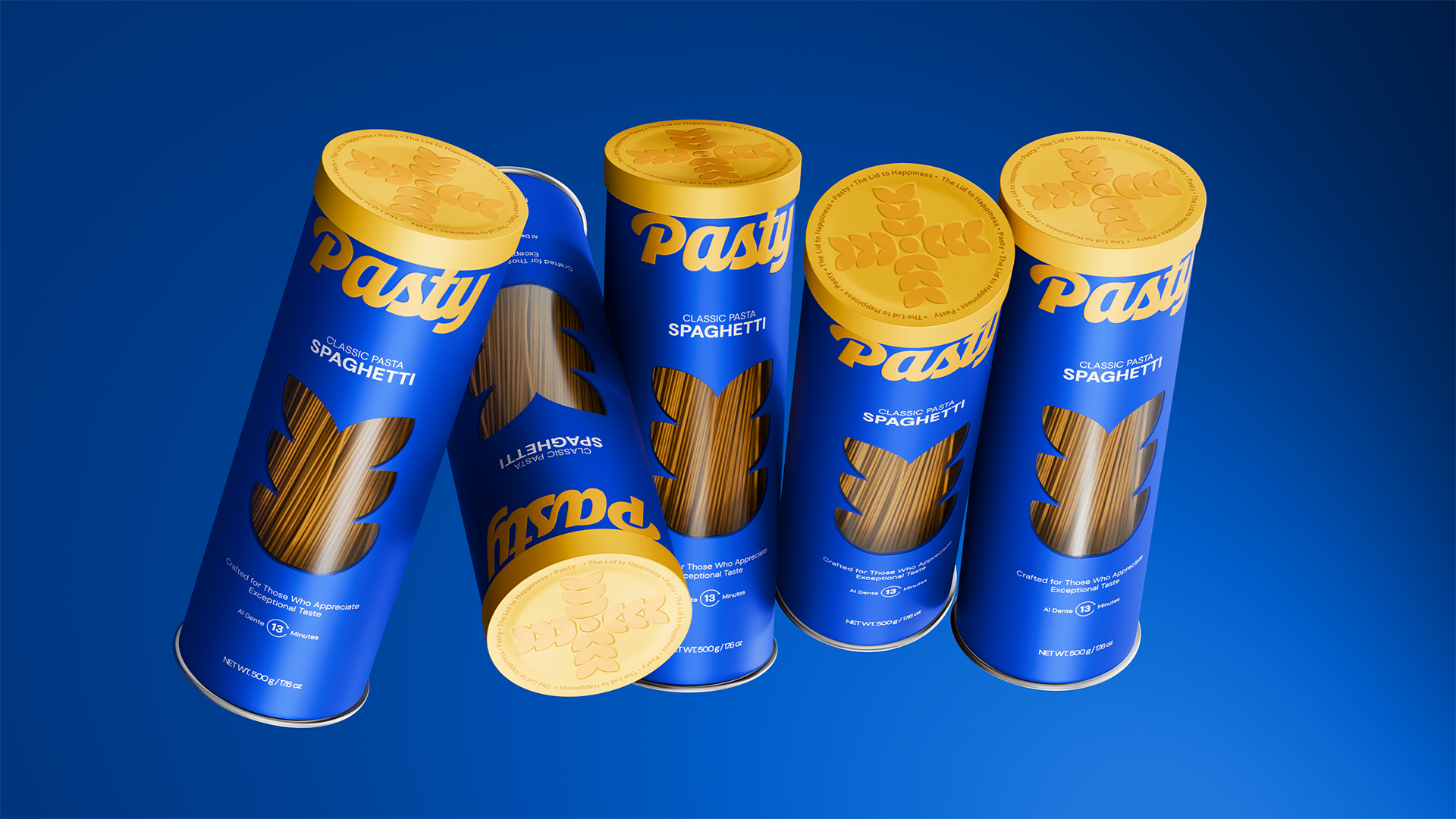
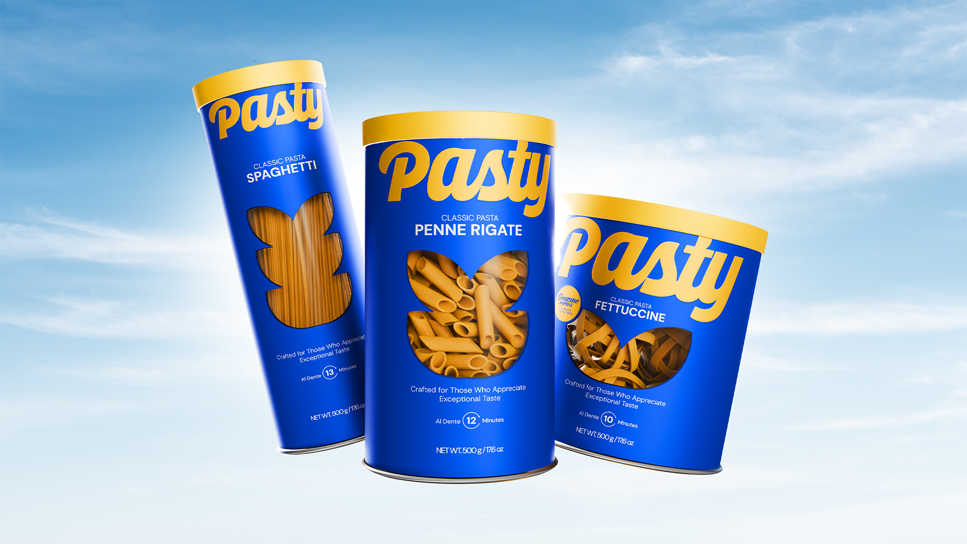
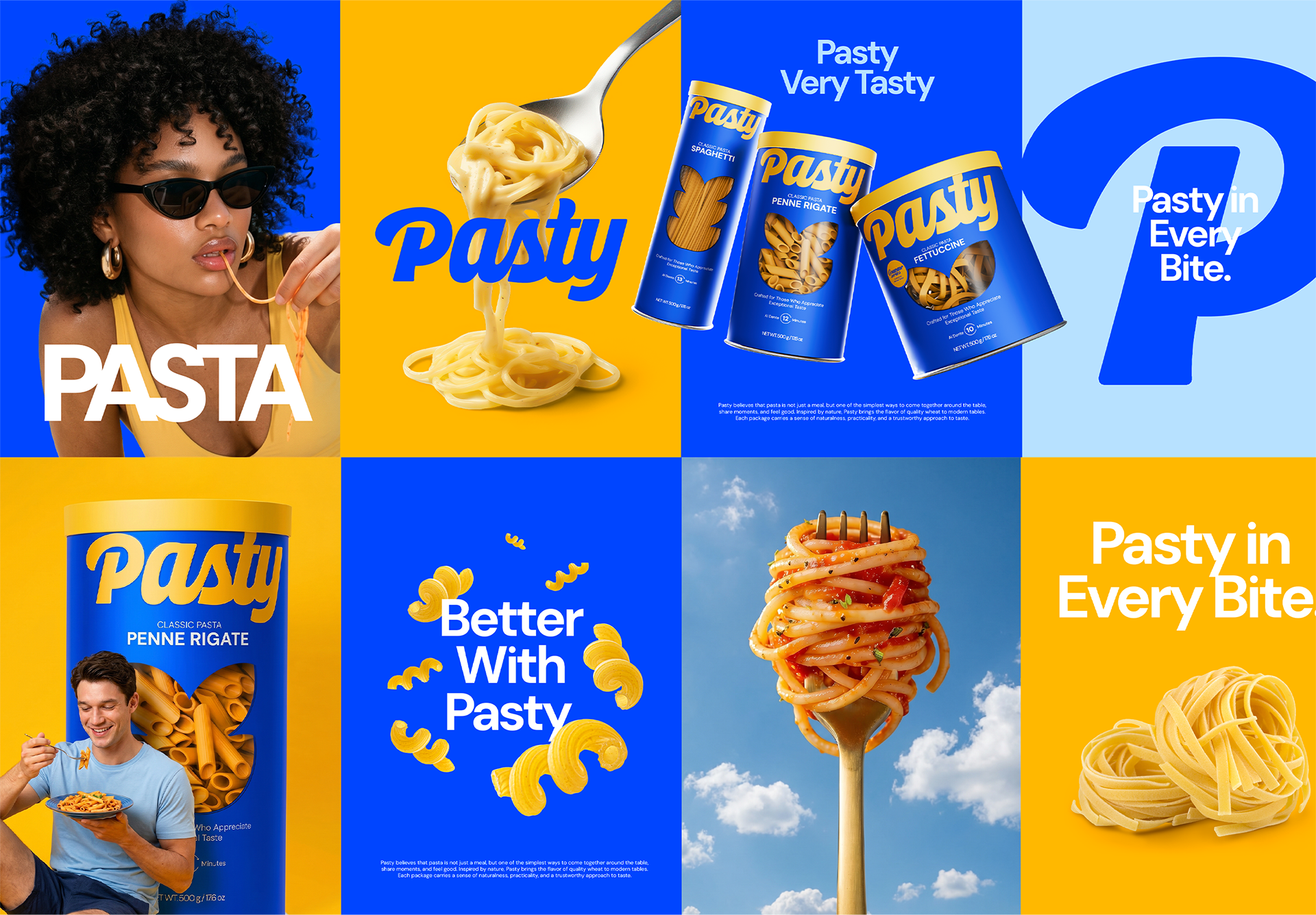
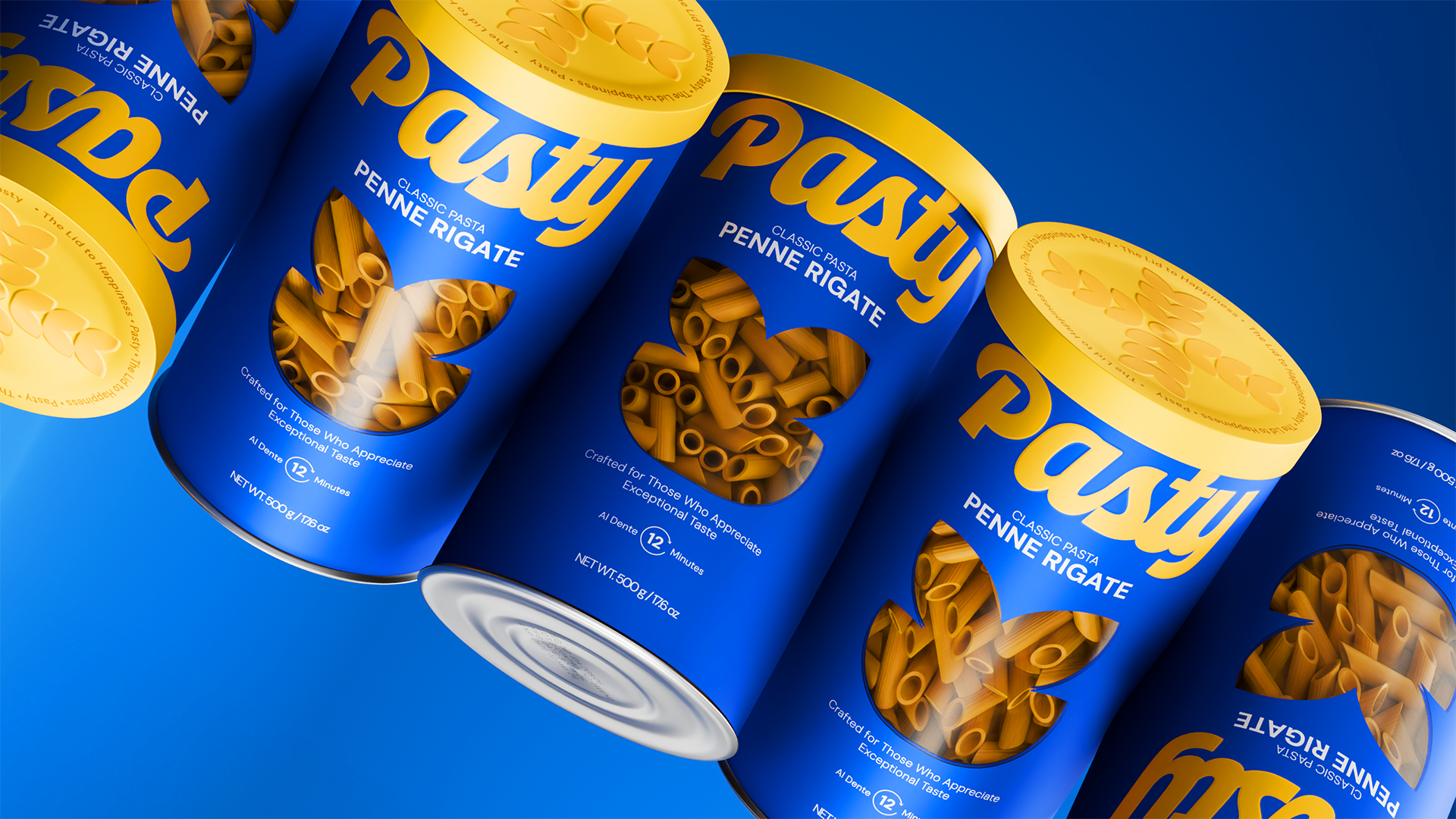
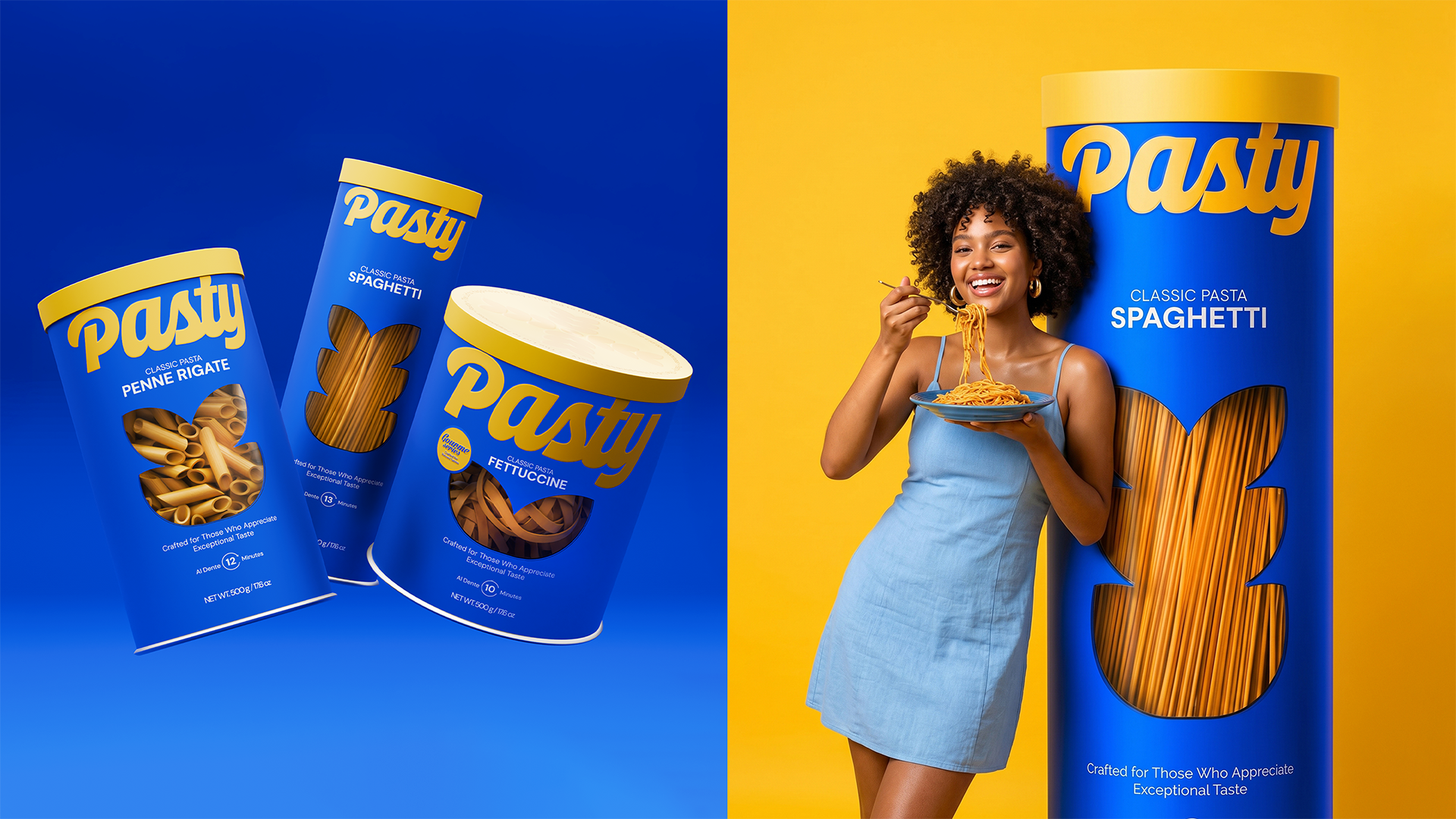
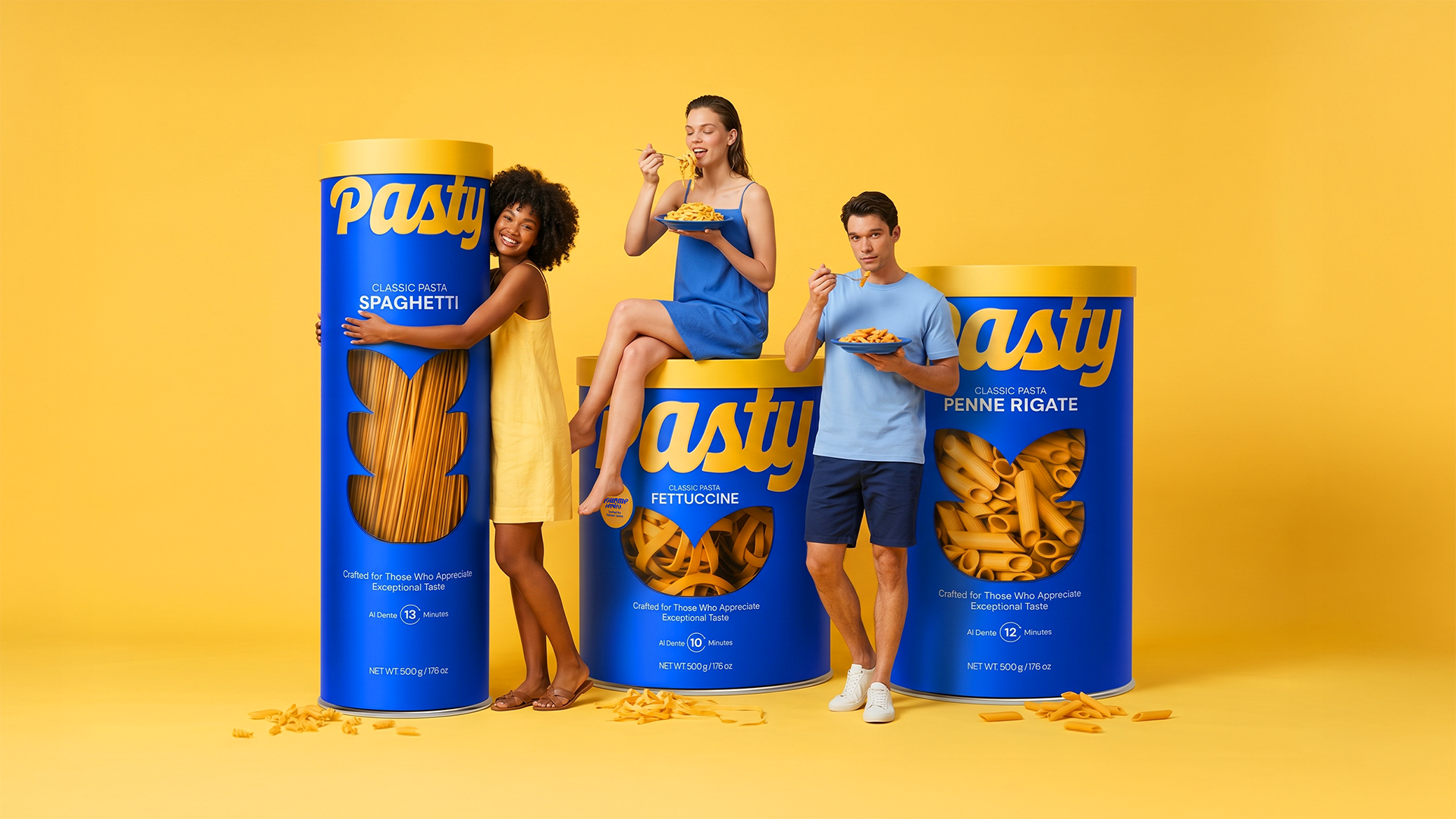
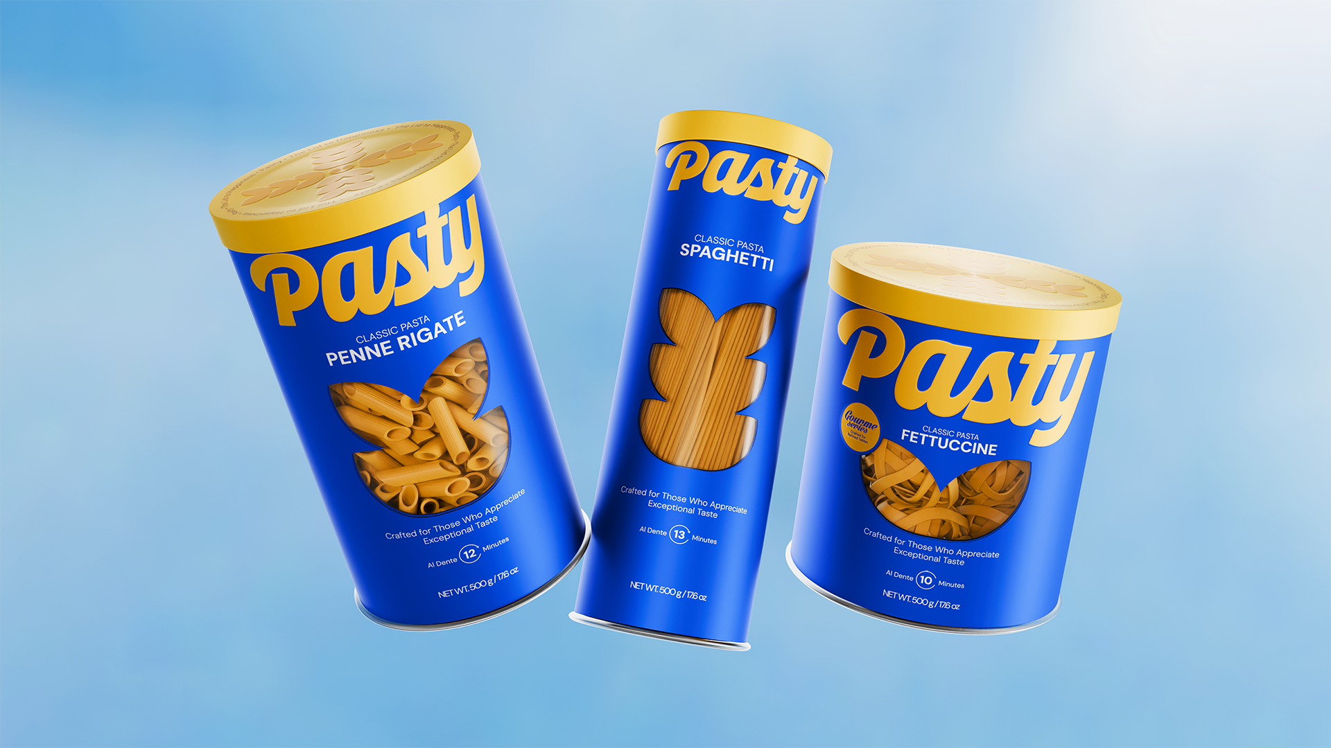
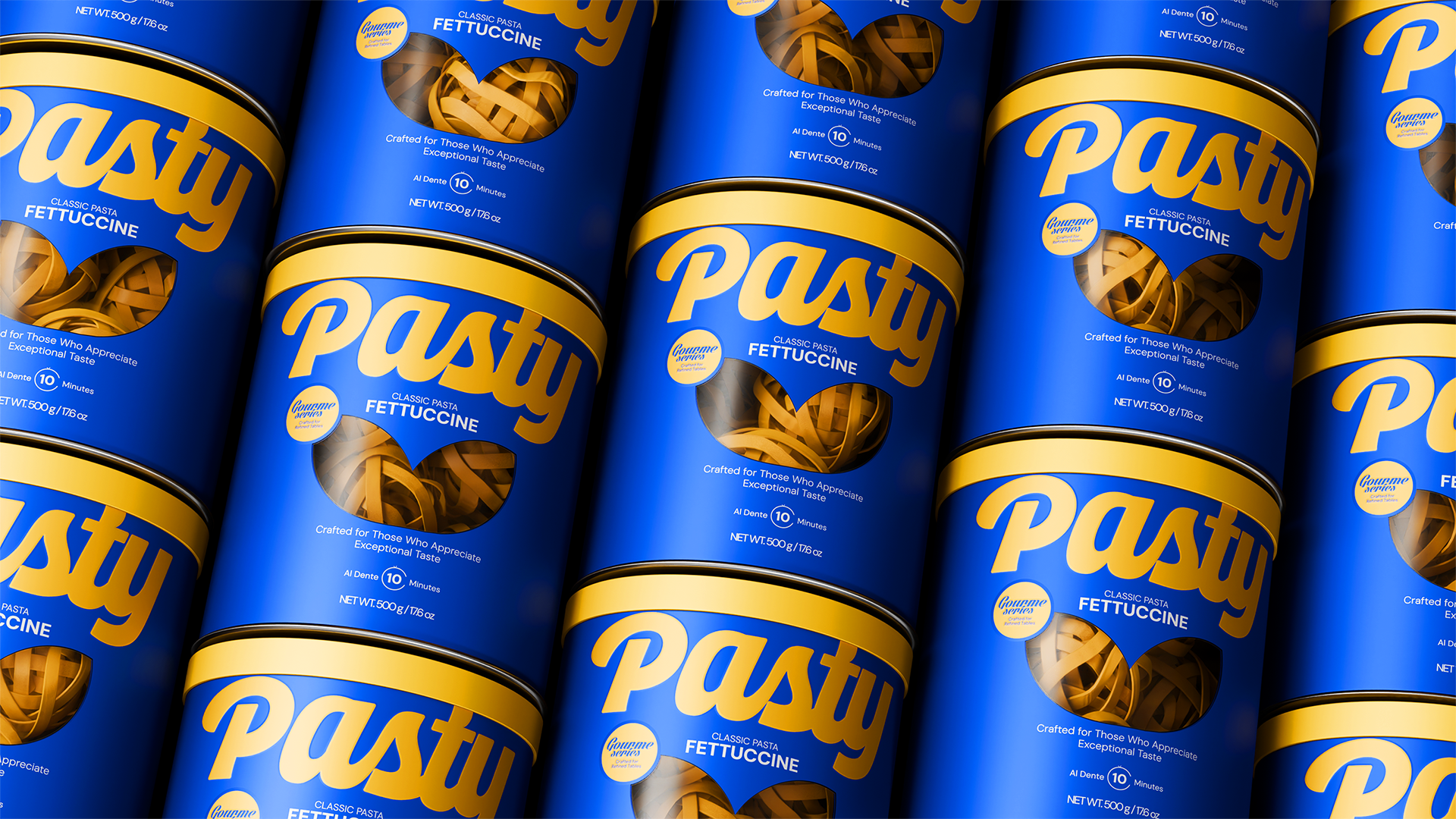
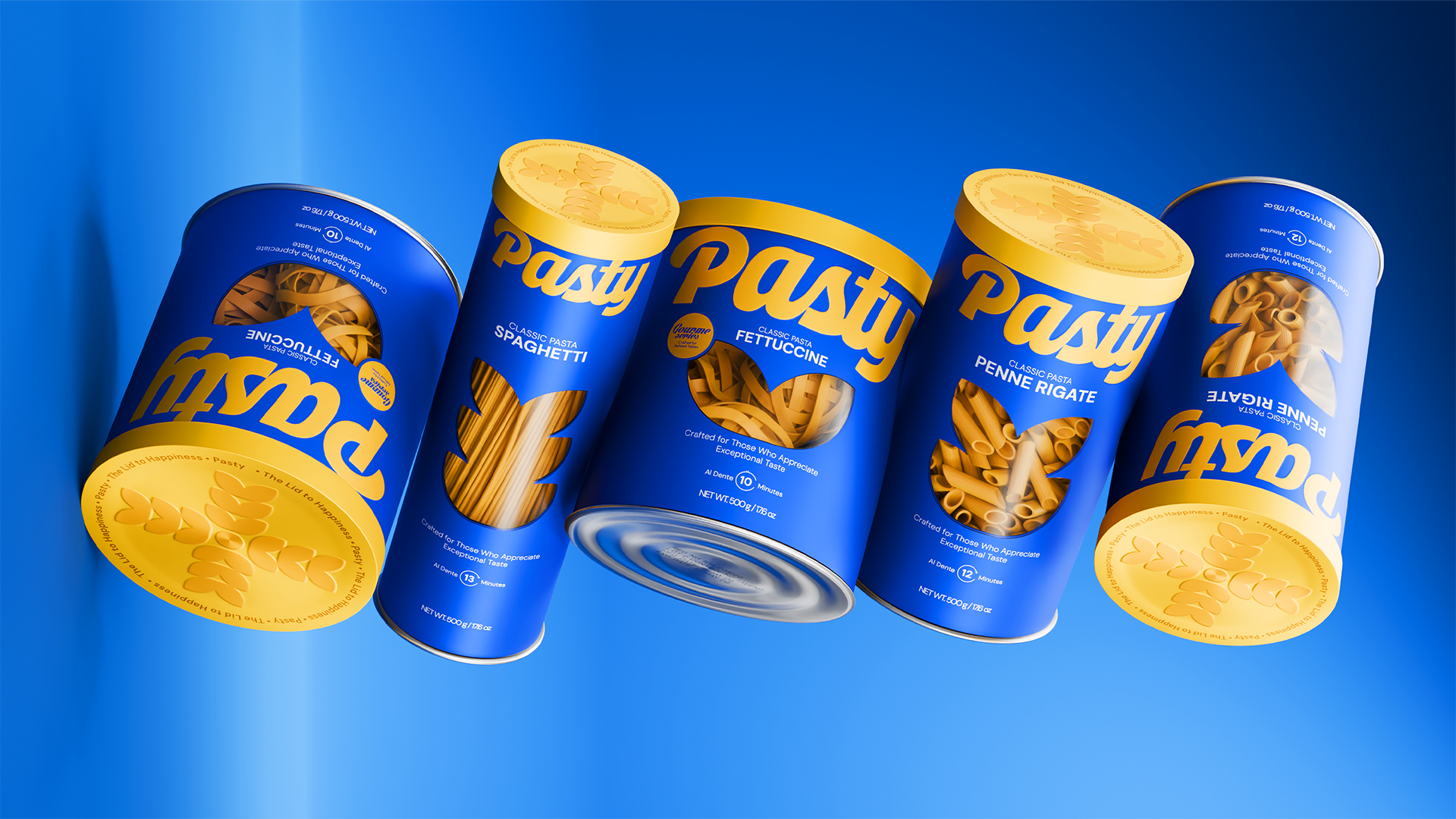
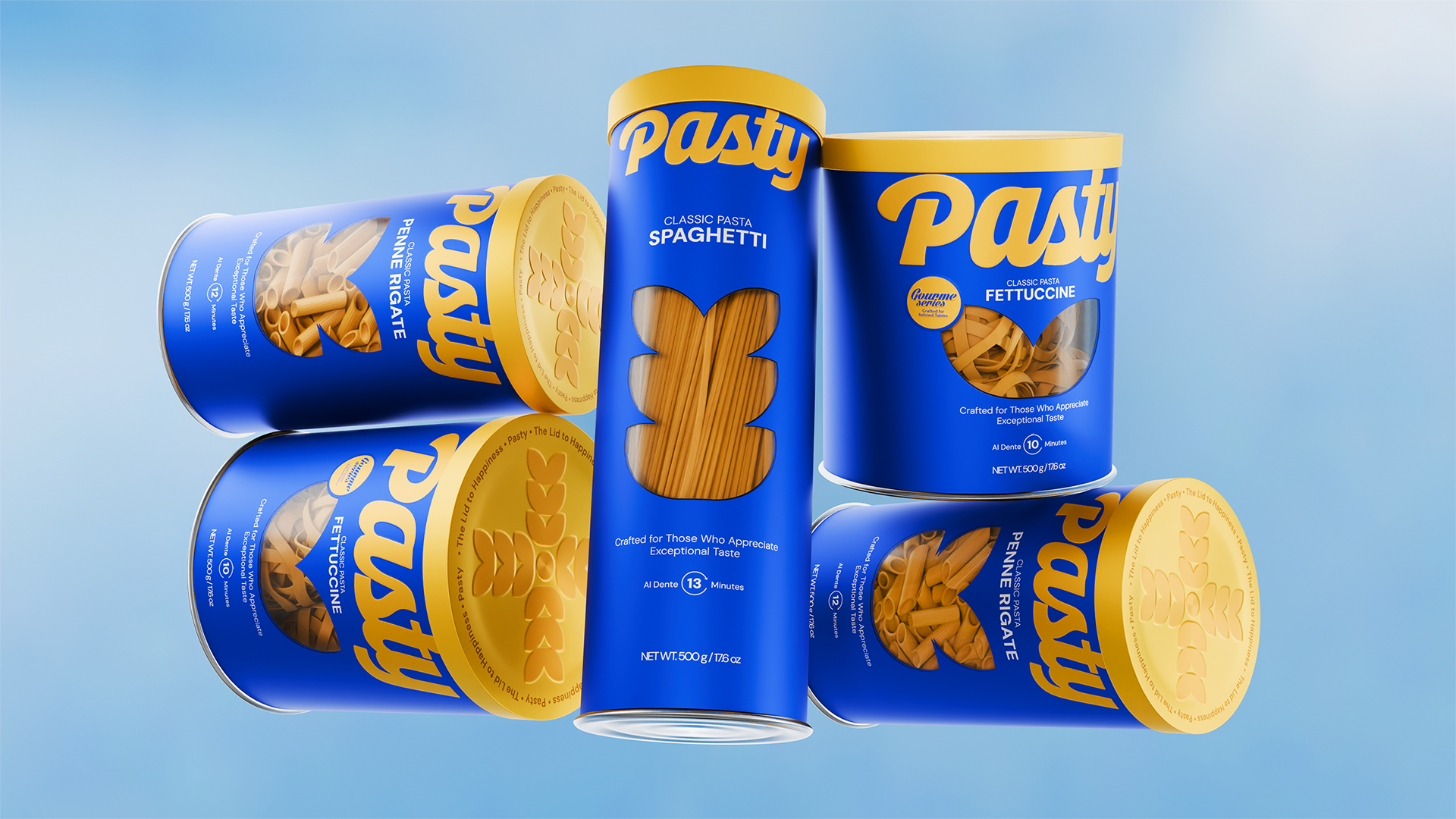
Breaking the mold in packaging design, we bypassed traditional plastic bags in favor of cylindrical boxes that instantly stand out on shelves like design objects.
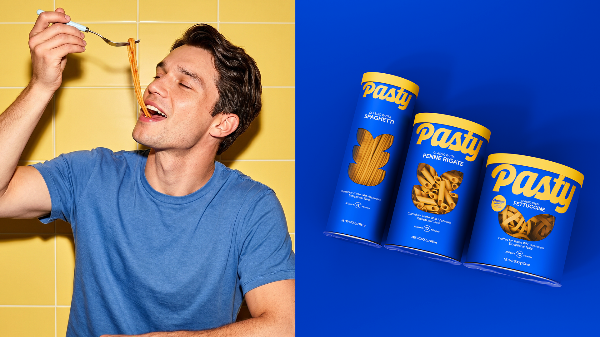
Product families such as Spaghetti, Penne Rigate, and Fettuccine through minimalist windows and iconic pasta illustrations on the packaging. Our goal was to ensure that Pasty packaging isn't just a consumable to be hidden away, but an aesthetic piece that people want to display on their kitchen counters.
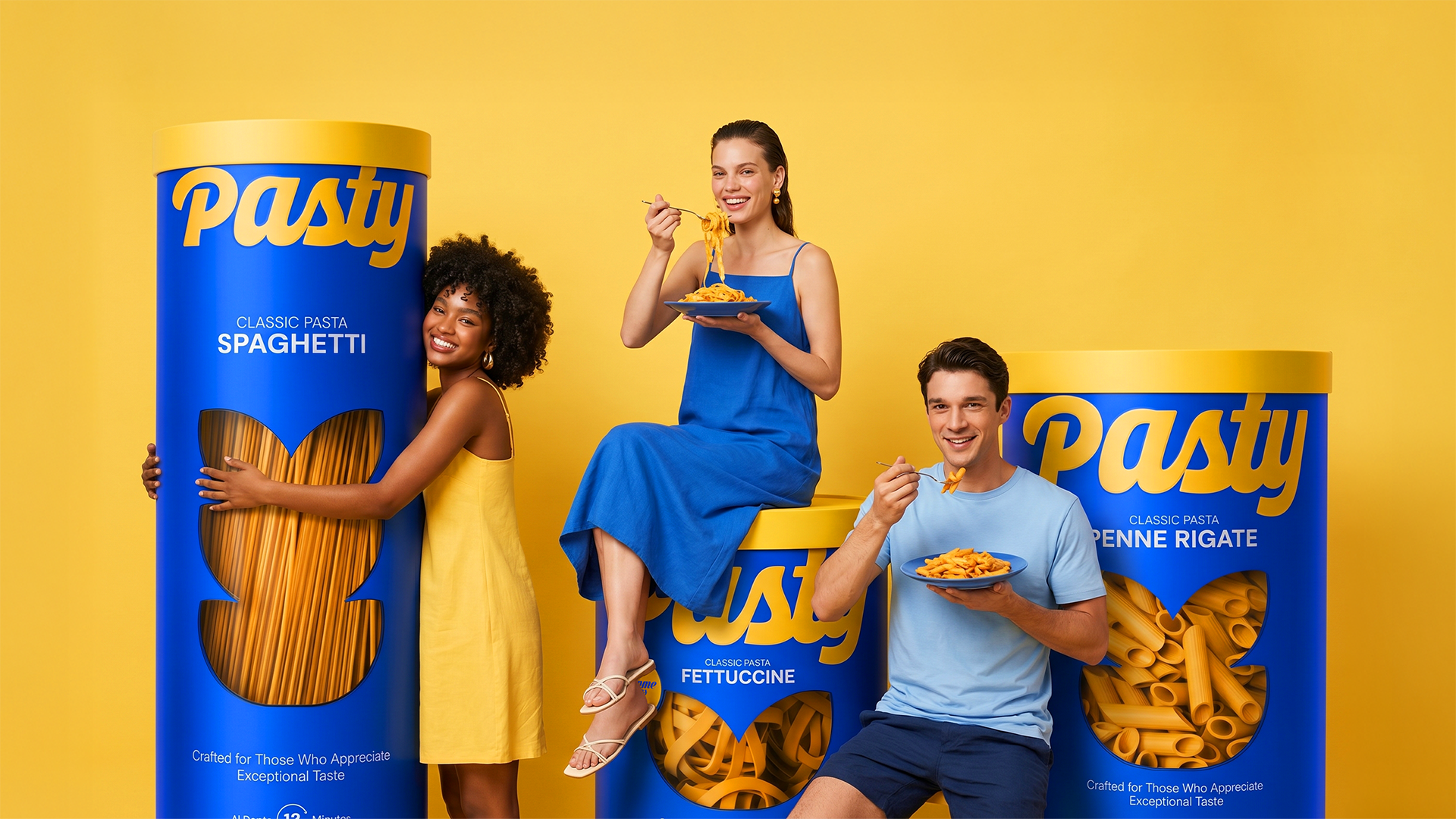
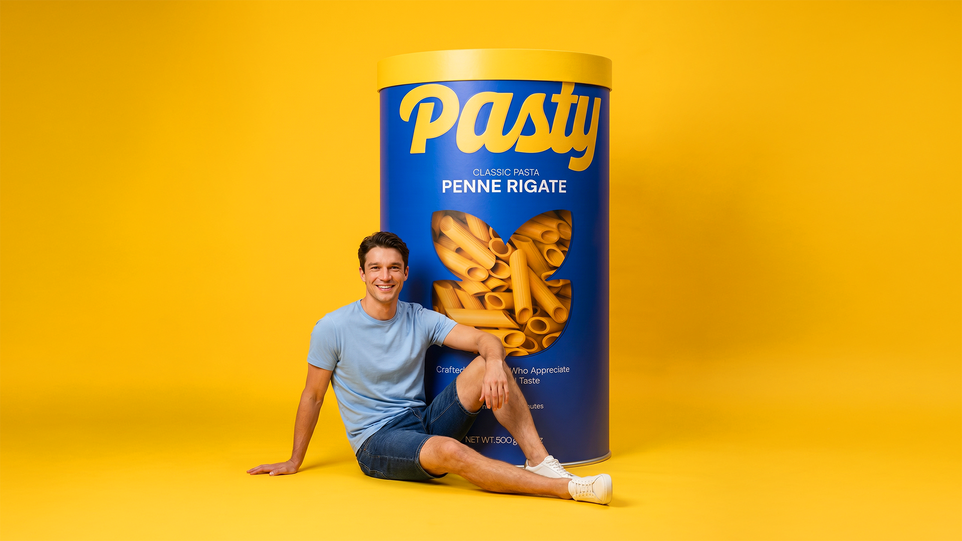
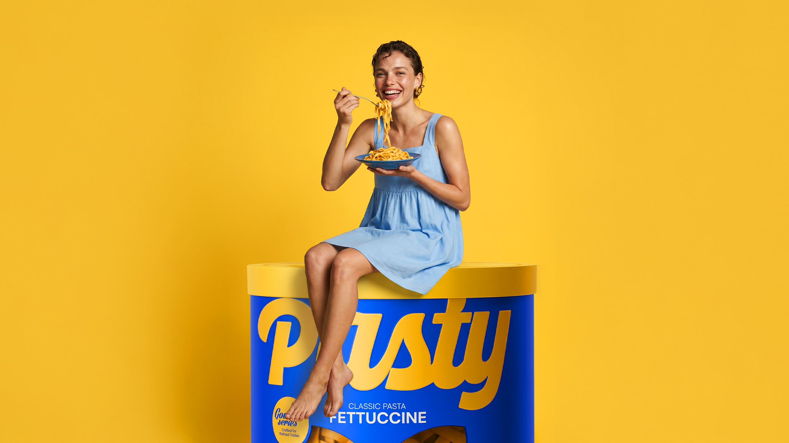
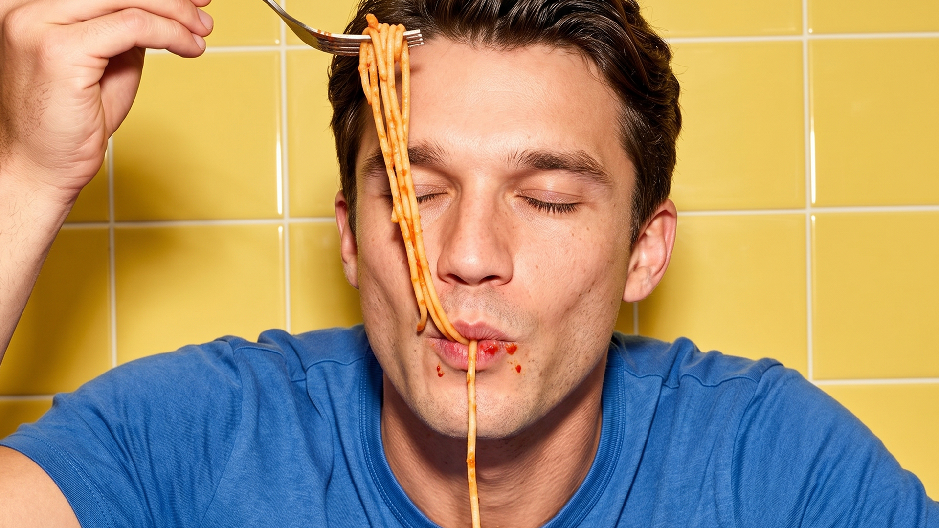
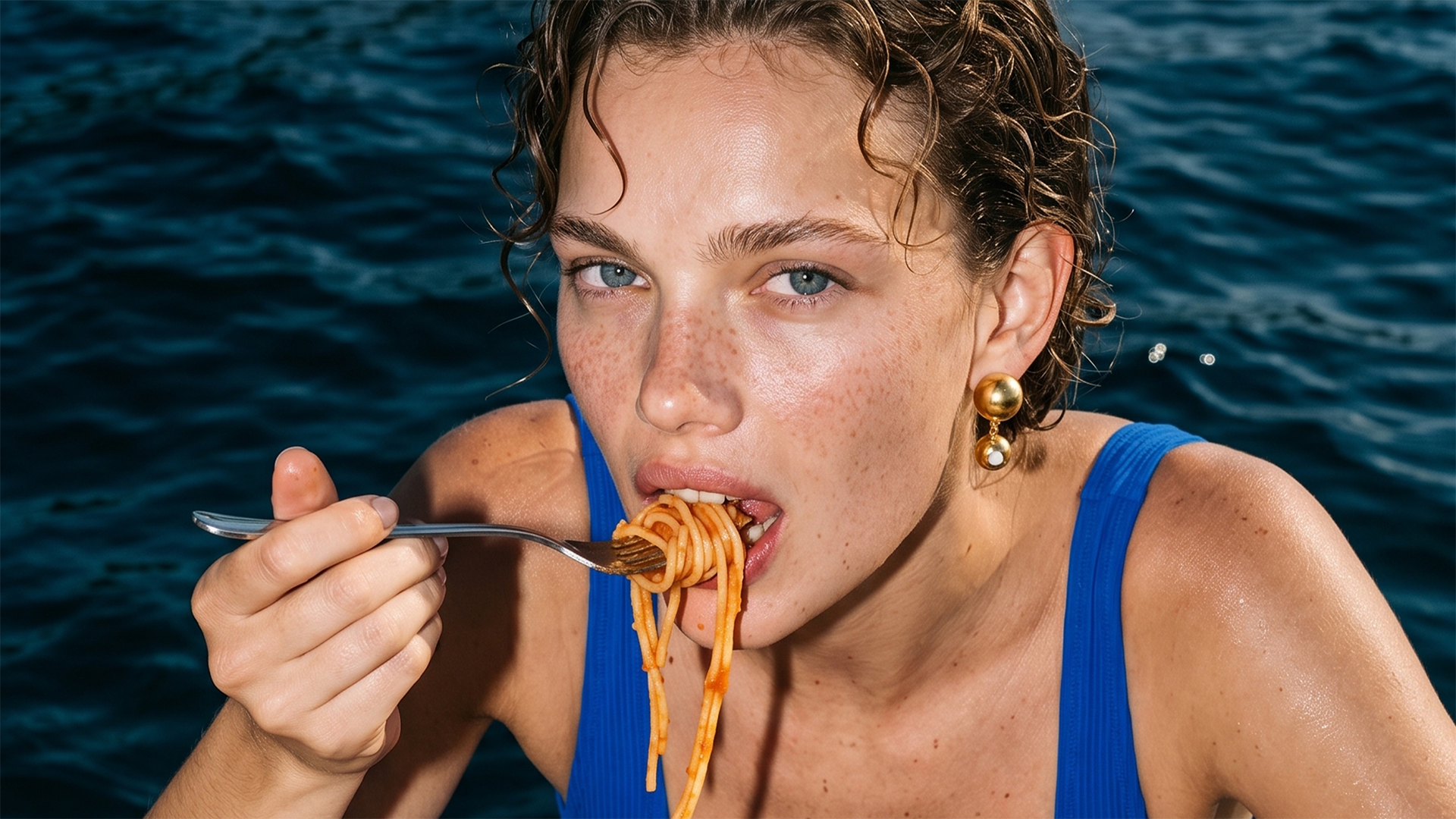
On the creative direction side, we rewrote the rules; we took pasta away from the perception of a heavy winter comfort food and infused it with summer energy. Built around the mottos "Better With Pasty" and "Pasty in Every Bite", our campaign captures free-spirited, stylish characters enjoying pasta by the pool, under the sun. With this vibrant, youthful, and dynamic campaign language, we transformed Pasty into a fun, refreshing experience that accompanies every moment of the modern individual.